
The Ink Spill No. 6
Another installment of the Ink Spill is right here, in front of your face area! Check it out party boy!
No. 1- Captain America #10 (Parel Variant)
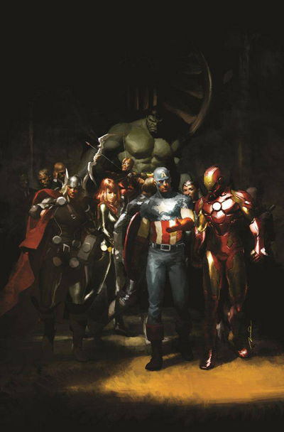 |
| art: Gerald Parel |
Avengers! The block buster movie event that is Marvel's all star assemblage is right around the corner. Lots and lots of people are very excited about the film and while I don't necessary count myself among them, I do enjoy the Avengers. The idea of organizing (and even regulating) the resources of super-powered beings is not only practical but also pretty appealing. Much to my surprise Marvel has been doing a pretty good job of striking a balance between integration of the movie property into the realm of its print and digital comics and keeping said comics separate enough to not feel overly bogged down.
This cover for Captain America #10 is a great example of this. Gerald Parel has created an interesting mix of current and classic. One of my biggest gripes with Avengers as a property is that it's too much of its own thing and to me it feels like it could exist outside of the Marvel universe entirely. Here in this cover Parel has opted to mostly utilize classic representations of the depicted characters, with artful integration of very modern designs (Ultimate style Nick Fury blends well with Oliver Coipel's Thor). The realistic rendering style is very reminiscent of Alex Ross while also possessing a more painterly feel. The starkly classical triangular composition lends a strong air of artistry to the piece and accentuates the element of cohesion within this particular Avengers lineup.
Overall I really enjoy this cover and I'm glad the print end of things is still (barely) able to stand on its own. This specific Cap arc very nicely deals with less canon characters like The Falcon and those are kinds of things that the film adaptations should be doing more often.
Publisher: Marvel Comics - Available: April 25, 2012
Hit the jump for a couple more covers plus my dumb thoughts about them!
No. 2 - AVX: VS. #1 (of 6)
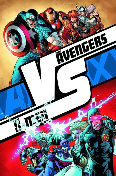 |
| art: Adam Kubert |
I'm a big fan of Adam Kubert and I'm usually all over his stuff. Fortunately for everyone, his stuff has been all over Avengers VS X-Men, Marvel's latest major comics event. This cover is actually for the series of premiere books that are tied into the event and the overall layout of the cover is reflective of that. This piece feels like a great hype poster for a battle that everyone wants to see. Ali vs. Foreman, Sports team A vs. Sports team B, Rocky vs. a rock.
The liberty taken with primary colors doesn't feel tacky, it feels like this is the poster that you saw outside the arena before you bought your ticket to watch Red Hulk punch Colossus in the face, repeatedly. I love what Marvel is doing with this event. This feels like a Civil War type of event where the stakes are high and the fight card is filled with the A list.
Avengers VS X-Men is a massive event with a ton of talented writers and artists running through it and I for one am very excited to see how it plays out.
Publisher: Marvel Comics - Available: April 25, 2012
No. 3 - Captain America #10 (Alan Davis Regular Cover)
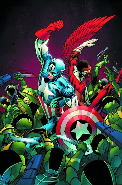 |
| art: Alan Davis I think it's also worth mentioning the regular print version of this issue since it's awesome. While I prefer the variant, I think this cover by Alan Davis is great in that classic hero surrounded by villains in the foreground way that was all over 60s-70s books (Cap and Falcon especially). Also any visibility The Falcon can get these days has got to be good for him right? |
Davis' stuff just has such a classic groove to it and it's on display here in full force. I'd like to go on record right here and say that since the Donald Glover for Spider-Man campaign didn't exactly go as far as I would have liked, the Falcon should get his OWN movie and it should star none other than Donald Glover. Get to work Marvel.
Publisher: Marvel Comics - Available: April 25, 2012
No. 4 -Indie Pick- Nazi Zombies#2
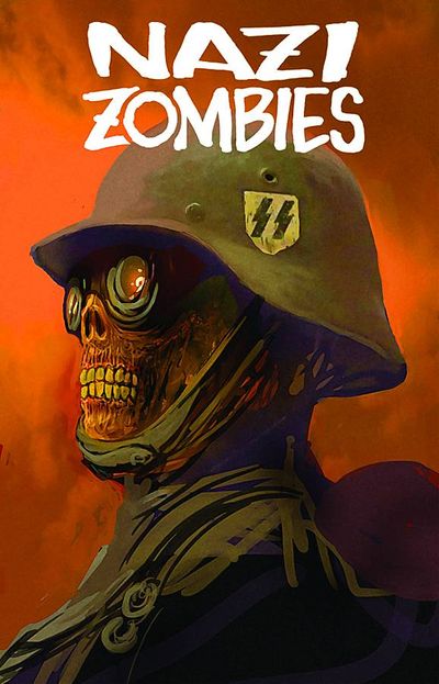 |
| art: Ben Dunn |
Straight up, I don't know this book. I don't know what the premise is (wild guess: something to do with both Nazis and zombies). But from the other covers I've seen, this series is fucking cool. I don't know Ben Dunn but I'd like to think that he's aware of how enormously absurd the idea of a zombie/Nazi mash-up is (Dead Snow anyone?) and if not then somehow that adds another layer of brain flavored awesome to this weird, weird sandwich.
The simple portrait style of these covers combined with the pulpy movie poster text really does it for me. This piece in particular reminds me a lot of something you'd find in The Goon. I'll definitely be checking this book out. Laughs will ensue.
Publisher: Antarctic Press - Available: April 25, 2012
No. 5 - Exile On The Planet Of The Apes #2
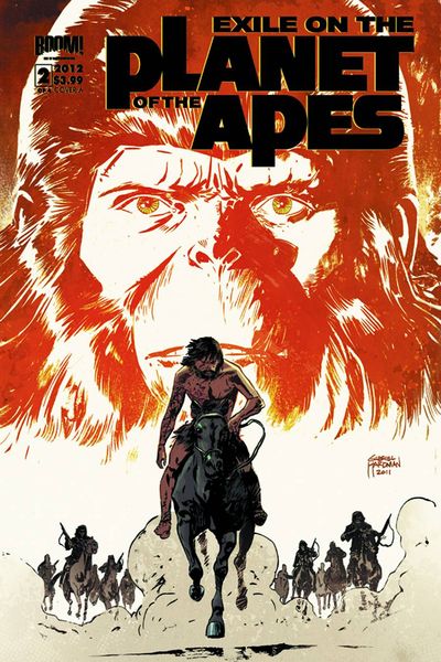 |
| art: Gabriel Hardman |
This one shouldn't really need an explanation. The Planet Of The Apes as a property is as strong as ever these days, with an awesome prequel and strong tie in material like this. Much of the success of this piece is owed to the iconic look created by John Chambers in the original film. The rendering is reminiscent of Joe Kubert's primitive scenes and the composition is firmly planted in the film poster realm of presentation. This is the first I've seen of Gabriel Hardman but I'll be keeping an eye on his stuff in the future.
Publisher: BOOM! Studios - Available: April 25, 2012
No. 6 - The Lil' Depressed Boy #10
 |
| art: Sina Grace |
Publisher: Image Comics - Available: April 25, 2012
No. 7 - Mighty Thor #13 (Richard Isanove Art Appreciation Variant)
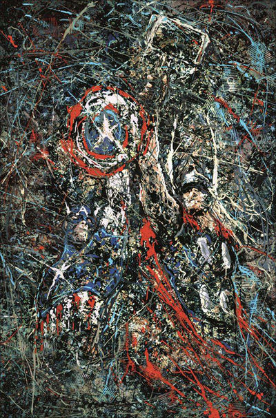 |
| art: Richard Isanove |
Richard Isanove is the rare colorist who I follow independently as an artist as well. His work over Andy Kubert on Wolverine: Origin and 1602 redefined for me what comics coloring could be. He is the artist I think of when I think painterly coloring techniques.
This cover is the encapsulation of all of that for me. This is a beautiful piece of art unto itself. Comics as a medium have progressed enormously since its early development but there is still a massive amount of progress required to be widely considered a valid artistic medium. Pieces like this are what makes that progress happen. Isanove's integration of painterly rendering into the comics field is taken to an extreme extension. Drawing instant associations to Jackson Pollock, this piece demands a certain respect from the viewer that is often sorely lacking in comics.
Publisher: Marvel Comics - Available: April 25, 2012
That'll do it for this installment of The Ink Spill. Thanks for reading. Let me know about awesome comics by emailing me at scott.speegle@gmail.com .Or just send me nice things and be my friend. Keep nerding and check back here for more updates about things we, and nerds like you care about.
Thanks
Scott
No comments:
Post a Comment