Hey guys, another edition of the Ink Spill is here so you can look at pretty pictures and subsequently see what I have to say about them.
-No.1-
Iron Man 2.0 #11
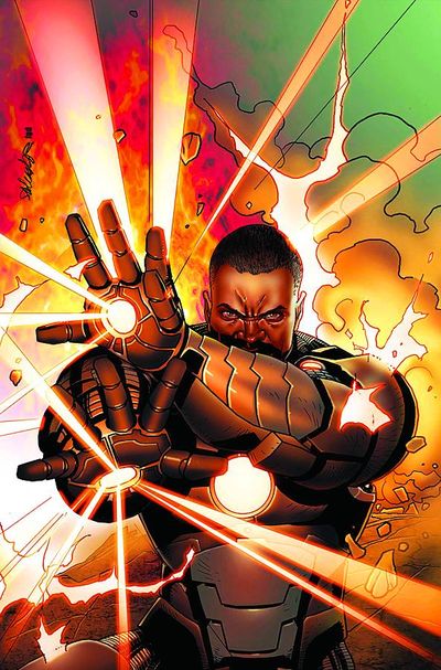 |
art: Salvador Larroca
Apparently Iron Man is going through some tumultuous times and Rhodey is getting a lot of focus these days. I can't say that's a bad thing as I personally have always loved the contrast that the War Machine color scheme offers to the vibrancy of the red and gold. Salvador Larroca is definitely a cover guy and he's shown what he can do with Iron Man all throughout Matt Fraction's handling of the book. While this iteration is being penned by Nick Spencer, Larroca's cover are still great to have. I'm not the biggest fan of the hard black lines in the background but the coloring overall on this is great and as dynamic a compliment to the line work as anything I've seen dropping this week.
Publisher: Marvel Comics - Available: December 14, 2011
More after the jump!
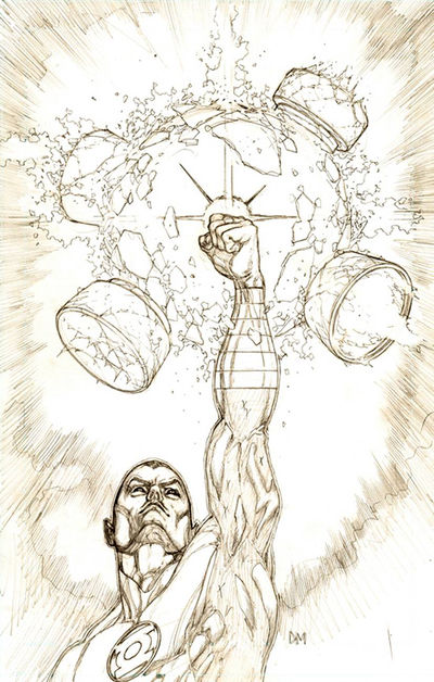
-No. 2 - Green Lantern #4 (Sketch Variant)
art: Doug Mahnke
Sketch variants of covers are one of my favorite things ever. Many times a piece can be bogged down by inks, colors, and all the other stuff that gets thrown on top of the pencils. Sometimes it's great to see a piece from an artist you like in print as if it came right out of their sketchbook and since Doug Mahnke is one the absolute best Green Lantern artists, this particular cover is quite the treat. The rendering of the image is obviously strong enough to carry itself without any of the supplemental stuff that goes into a cover. Careful observation however shows the use of x markers to indicate where heavy blacks will be laid in for the final cover. For comparison here is the regular cover below.
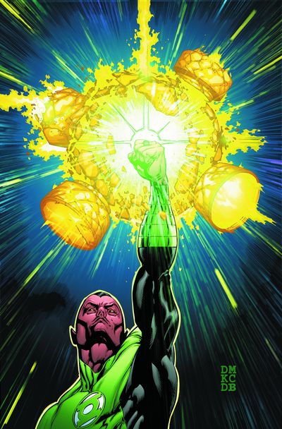 The almost painterly quality to the coloring is nice but I actually prefer the starkness of the pencils. Mahnke's lines also give Sinestro's face a more emotive quality than what comes through in the inked version. Hell, get 'em both and decide which one you like more... since variants aren't all about getting more of your money for essentially the same thing...it's a good cover dammit!
Publisher: DC Comics - Available: December 14, 2011
listings on both versions of this have been pretty iffy at the time of this writing so I'm not sure if it will be available on this date but it's the best estimate so fa
-No.3 - Grifter #4
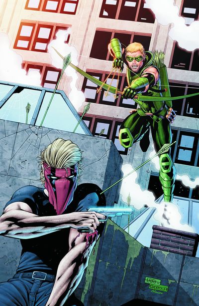 art: Jason Gorder
While it's strange for me to see Grifter not drawn by Jim Lee and him drawn this way does not work for me at all, I really like this cover. I think the main reason I like it is the fact that within the reboot someone has finally decided that Green Arrow should not have a fucking vandyke. What's the least conducive thing to maintaining a secret identity? Probably having the most recognizable, unhidden facial hair imaginable. I'm glad that glaring element of stupidity has been removed from Green Arrow's identity and it's probably the best thing to come out of the reboot thus far.
Publisher: DC Comics - Available: December 14, 2011
-No. 4 - DC Presents: Batman The Secret City #1
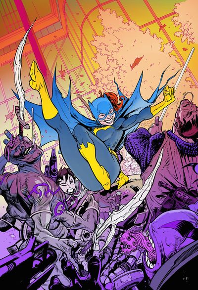 art: Tom Fowler
Barbara Gordon is one of my favorite characters and I'm a huge sucker for her in her classic suit. That said, what really gets me about this one is the really tangible fun vibe it has. I know dudes and monster dudes are getting the shit kicked out of them but look how much Babs is having! Also they're purple!
Publisher: DC Comics - Available: December 14, 2011
-No. 5- Marvel Holiday Comic 2011 #1
 art: unlisted
And my top pick this week is this unfortunate piece of garbage. I'm not one to rip people's art but the holidays are the perfect time to see bad comic covers. A lot of stuff needs to be churned out and because of this the level of quality usually falls pretty low. The wonky anatomy, extremely flat figures, basic rendering, forced perspective, and god awful composition are reminiscent of art you'd see on a crappy toy box or some other disposable piece of merchandise. I think the worst part about this cover is how half-assedly holiday like it is. Four vaguely themed stockings and some icicles? Really? This is just one more reason to hate the holidays and I'm only marginally glad to see that this kind of piss poor quality only really peeks its ugly head out of the ass of professional comic art around this time of year.
Publisher: Marvel Comics - Available: Who cares?
That's it for this issue of the Ink Spill. I hope everyone has a great holiday and spends quality time with the important people in their lives. Read some comics, play some Skyrim, but also do that spending time with the people thing cause that's important.
-Scott- |

No comments:
Post a Comment